How to Choose Drapery Fabric and Color in Indianapolis
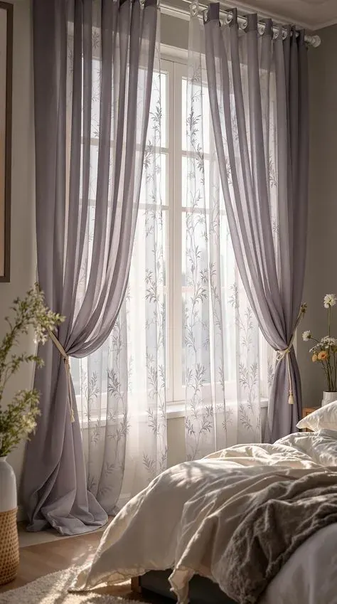
Walk into a handful of Indianapolis living rooms and you will see just as many reasons a particular fabric and color got chosen, some good, some based on a swatch that never got tested against the actual window. There is a fair amount of trade knowledge behind a decision that looks simple from the outside.
Fabric Weight and How Drapery Falls
A formal dining room and a sunroom call for different weights even if the window sizes match. In a dining room, a heavier fabric like a linen-cotton blend or a light velvet gives the panels enough structure to hold a clean pleat and read as intentional rather than an afterthought. In a sunroom or a casual family space, that same heavy fabric can feel wrong, closed-in and formal where the room wants to feel open.
Ceiling height changes the math too. A room with nine or ten-foot ceilings can carry a heavier, more structured fabric because there's enough vertical space for the eye to read the fullness. In a standard eight-foot room, a fabric that's too heavy can make the ceiling feel lower than it is, while something lighter keeps the wall feeling tall.
We walk into a lot of Indianapolis living rooms where the furniture already leans heavy, think a substantial sofa and a big rug, and in that setting a lightweight linen panel is often the better call because it keeps the window from adding even more visual weight to a room that already has plenty.
Pattern and Texture
Ask what the pattern repeat is in inches before ordering, both vertically and horizontally if it's a two-directional print. That number determines how much extra fabric the job needs and whether the pattern will center itself nicely on the window or land awkwardly off to one side.
Ask to see the fabric in a hank, not a flat swatch, if texture is a big part of the decision. Texture reads completely differently in folds than it does lying flat, and a swatch card genuinely cannot show you how a slub or a weave pattern is going to catch light once it's pleated.
And ask whether the fabric is directional, meaning it has to be cut and sewn with the pattern running one specific way. That affects how much fabric gets used and, on a big Indianapolis window needing multiple widths, whether there's enough yardage left over if a cut goes wrong the first time.
Light Control and Lining Options
A lining mistake we run into constantly: someone orders blackout drapery expecting the room to go fully dark, and it doesn't, because the panels don't extend past the window frame far enough or the rod sits too far from the wall. Light finds every gap. If full room darkening is the actual goal, the return of the panel needs to sit close to the wall on both sides and the rod needs enough height above the frame.
Another one: pairing a thin, cheap lining with an expensive face fabric. The lining is doing real structural work, holding the shape and protecting the face fabric underneath, and skimping on it undercuts the nicer fabric you already paid for. It's a strange place to cut cost.
We've also seen lining chosen by feel in the showroom rather than by testing it against actual daylight. A lining that looks opaque under indoor lighting can still show shadow and some light transfer once it's hung against a bright Indianapolis afternoon sky, so ask for a sample held up to a real window if full opacity matters.
Fullness and the Hardware Behind It
Fullness is the ratio of fabric width to rod width, and it's the biggest reason two panels made from the same fabric can look completely different once hung. A pleated panel at standard fullness, roughly two to two and a half times the rod width, falls in defined, even folds. Cut that ratio down to save fabric and the panel looks flat and skimpy no matter how nice the fabric is.
Heading style changes how much fullness you actually need. A grommet panel typically wants less fullness than a pinch pleat to look right, because the grommets themselves create even waves. A ripplefold panel, riding on a track with evenly spaced carriers, often needs the least fullness of all because the wave spacing does most of the visual work.
None of that matters if the hardware underneath can't carry the load. A wide Indianapolis window with a heavy, fully lined panel needs a rod rated for that weight, ideally with center support if the span runs past six feet, or the rod will bow and the panels won't glide evenly.
There is no substitute for asking these questions out loud with someone who installs drapery for a living. A free in-home measure at your Indianapolis address is a practical place to start, whether you already have a fabric picked out or you are still narrowing things down.
Color and Sun Exposure
Dark, saturated colors, think navy, hunter green, rust, or a deep charcoal, tend to show two things a lot of people don't expect: dust and fading. Dust shows up as a dull haze on dark fabric that's much more visible than it would be on a mid-tone, and fading on a dark color often shows as an uneven patch rather than an overall lightening, especially where direct sun hits one section of the panel more than another.
Pale, soft colors have the opposite problem. They show soiling at the leading edge and along the bottom hem, where hands and floors touch the fabric, faster than a mid-tone would. Neither issue is really about color itself, it's about how visible normal wear is against that particular shade.
For an Indianapolis window with strong afternoon exposure, a mid-tone with some texture in the weave hides both problems better than a flat, dark solid or a very pale one. And regardless of the shade you land on, understand that sun exposure gets slowed with lining and UV-resistant fiber, never stopped outright.
Frequently Asked Questions
How do I know if a fabric is heavy enough for my window?
There is no single number that works for every window, but as a rough guide, anything under about six ounces per yard is going to move a lot and probably wants lining behind it for body. Wider windows and taller ceilings generally look better with a heavier, more structured fabric, while smaller windows can carry something lighter without looking skimpy.
Should I pick the fabric first or the color first?
Fabric type first, in most cases. The fiber content and weave affect how any color actually reads once it is hanging, sometimes softer, sometimes more saturated, so choosing color against a specific fabric sample is more reliable than picking a color in the abstract and hoping to find it in the right weight and construction later.
Do darker colors really show more wear than lighter ones?
They show different wear, not necessarily more. Dark, saturated colors show dust and uneven fading more visibly than mid-tones do, while very pale colors show soiling at the leading edge and hem faster. A mid-tone with some texture in the weave tends to hide normal daily wear better than either extreme.
 Window Treatments That Survive Tenant Turnover in Indianapolis
 What Roller and Solar Shades Cost in Indianapolis Homes Today
 What Actually Goes Wrong With Motorized Shades in Indianapolis